DIGITAL MARKETING DRIVING GROWTH
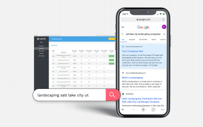
ATTRACT MORE LEADS
Lasso Up provides digital marketing services to help growing companies optimize their online customer experience, attract qualified leads, and accelerate growth. Request a free website report and start the conversation about your digital marketing strategy.

GROW YOUR BRAND AND BOTTOM LINE
Growth-Driven Digital Marketing Agency
Our team at Lasso Up is focused on helping you grow your business. We partner with business leaders to develop and execute digital marketing strategies. Do you want to “Lasso Up” higher-quality leads and turn your website into a lead magnet? Need help creating content and optimizing it for SEO? We are here to help.
Problems We Fix
Lasso Up provides marketing solutions for common digital bottlenecks
My brand looks old and outdated
A great way to scare away potential customers is to promote a brand that looks old and untrustworthy. Our brand design services can energize your company’s focus and help you attract the right customer.
+ Build a new brand
+ Refresh your existing brand
+ Attract higher-quality leads
We need help designing or maintaining our website
Not sure how to design an effective website? Need help with website maintenance? Our web design and development team is equipped to build and maintain a high-performing website.
+ Design an effective website
+ Improve website performance
+ Turn your website into a lead magnet
My website isn’t generating enough leads
Your website is like a car. To make sure it performs well, we need to perform upkeep in the form of SEO. Our experts can help identify areas of improvement and resolve technical issues to attract better traffic that converts.
+ Rank higher in search results
+ Attract your target visitors
+ Convert visitors into new leads
Creating content and managing campaigns takes too much time
We know creating and managing email, social, or blog content takes a lot of work. Our content management team is here to increase the amount of lead-generating content your business puts out on a monthly basis.
+ Save time with our content team
+ Do more with automated campaigns
+ Generate more sales-qualified leads
We aren’t growing fast enough or hitting our revenue goals
Not happy with your current growth or lack thereof? Want to be able to turn up or down your lead dial? Our team of certified PPC experts can help you build lead funnels and manage paid advertising campaigns.
+ Optimize your ad campaigns
+ Reduce your cost per conversion
+ Generate more leads
Case Studies
Lasso Up has provided digital marketing services to hundreds of clients since 1999. Whether the client was looking for brand design, website design, SEO, inbound marketing, or lead generation services, we worked hard to deliver for our clients. View all case studies.

GOOGLE ADS
Generating new leads & revenue with high-converting Google Ads campaigns for towing and collision repair services

BRAND & WEB DESIGN
Attracting higher-end customers and generating more leads through a new brand updated website.

INBOUND & SEO
New revenue stream proves profitable with execution of local content strategy.

BRAND & WEB DESIGN
Comprehensive brand and website redesign for an elder law firm enhancing accessibility, trust, and client engagement.
")
WEB DESIGN
New modern website attracts high-paying smart home automation customers and creates a better user experience.

GOOGLE AD CAMPAIGN
Discover how we generated more appointments by implementing a high-converting Google Ad campaign.

INBOUND & SEO
Increasing new business through an inbound marketing strategy that focuses on SEO and local traffic growth.
How Lasso Up Drives Growth
Ready to attract, engage, and delight new customers? Leverage our digital marketing services to turn prospects into new customers and grow your business.

Standout with an Attractive Brand
Brand Strategy Services
Brand Guidebook Services
Graphic Design Services
Logo Design Services

Design an Effective Website
Website Design Services
Website Management Services
Website Redesign
Landing Page Design

Attract Qualified Leads with Search
Local SEO Services
On-page SEO Services
Local Listings Management
Review Management Services

Build Your Brand & Attract Leads
Blog & Content Management
Copywriting Services
Email Marketing Services
Social Media Management
Our Marketing Blog
Get tips & important updates for your website, SEO, and inbound marketing campaigns.

10 Social Media Marketing Tips for Home Builders
Social media has become an essential digital marketing tool for home builders to reach and engage...

Website Accessibility: Ensure WCAG & ADA Website Compliance
Do you know if your website is WCAG & ADA compliant and accessible to all users? If not,...
Keyword Strategy & Research for Successful SEO Campaign
Our Keyword Selection Process: Initial Research Once your account is set up, our SEO experts...